Print, digital and product design for a mobile provider.

In 2024 I was the designer behind PhoneBox’s print, digital and product work. This page covers three chapters: print for ICEF Berlin and a new plans launch, seasonal ads and landing pages across the Canadian, US and NewSIM brands, and a new shopping section inside the customer portal.
Print and events
Trade show materials for ICEF Berlin and in store print for a new plans launch, designed across the Canadian, US and NewSIM brands.
A booth that worked for two markets.
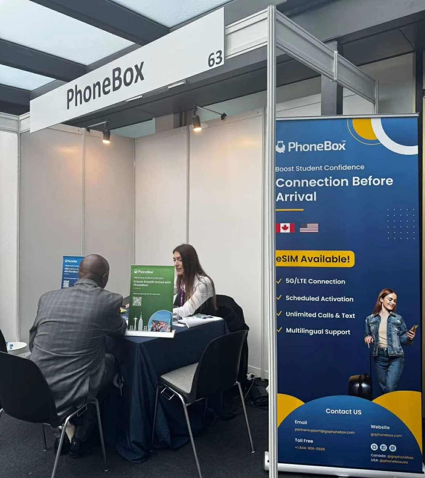
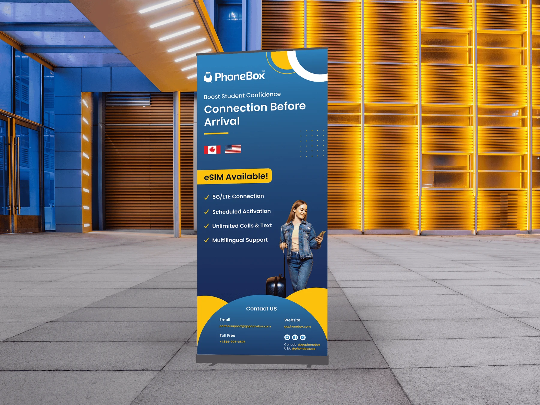
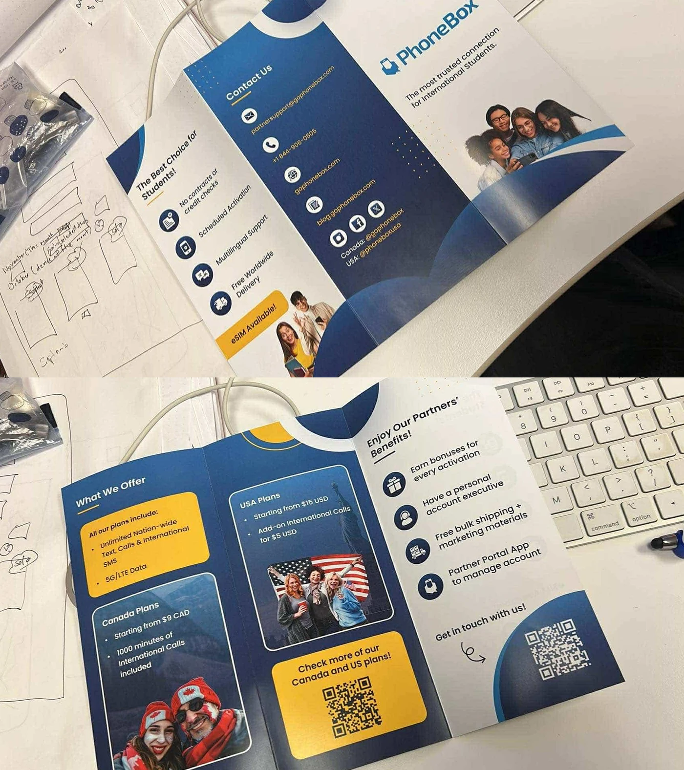
For the ICEF education fair in Berlin, I designed standing banners, tabletop banners and a tri fold brochure aligned with both the Canadian and US brands, plus a separate flyer for NewSIM, our new global eSIM product, in its own visual identity.
ICEF Berlin



In store print that explains the offer.
For the launch of new PhoneBox plans, I designed a standing poster, detailed plan flyers and a wall poster, all with one vibrant, cohesive look that makes the key benefits easy to scan.
New plans launch


Digital ads and landing pages
Seasonal promotions across Instagram and the website, plus refreshed Google Ads landing pages with an animated logo.
Seasonal promos across web and Instagram.
Instagram carousels for deals aimed at young, mobile savvy customers, plus website ads in banner, sidebar and pop up sizes so the message stays consistent everywhere.
Digital ads


Google Ads landing pages, refreshed.
I also redesigned the Google Ads landing pages for several markets and languages, adding an animated logo and motion graphics to the hero so the first screen feels alive.
Google Ads landing pages


Self Serve Shop
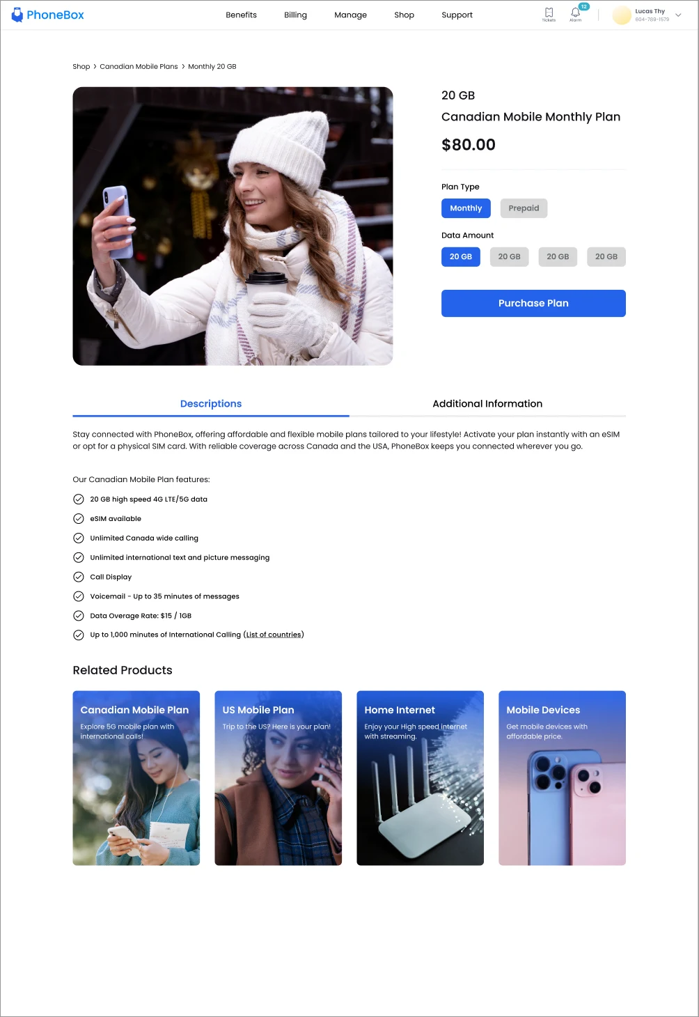
PhoneBox customers could manage their accounts online but had to leave the portal to buy anything new. I designed a shopping section for mobile plans, home internet, devices and accessories, from research through developer handoff.
A gap between managing and buying.
I gathered insights with the Customer Service and Operations teams, based on real customer conversations and feedback. Three pain points kept coming up.
Customers struggled to find and navigate products and services.
Managing an account and shopping for new services lived in different places.
Many customers never saw available products or promotions while managing their accounts.
Research to handoff, as the only designer.
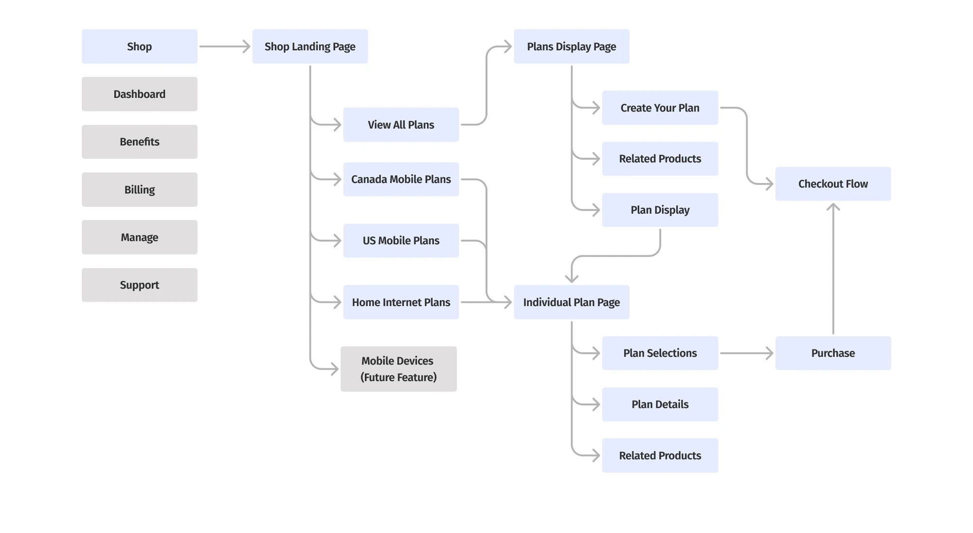
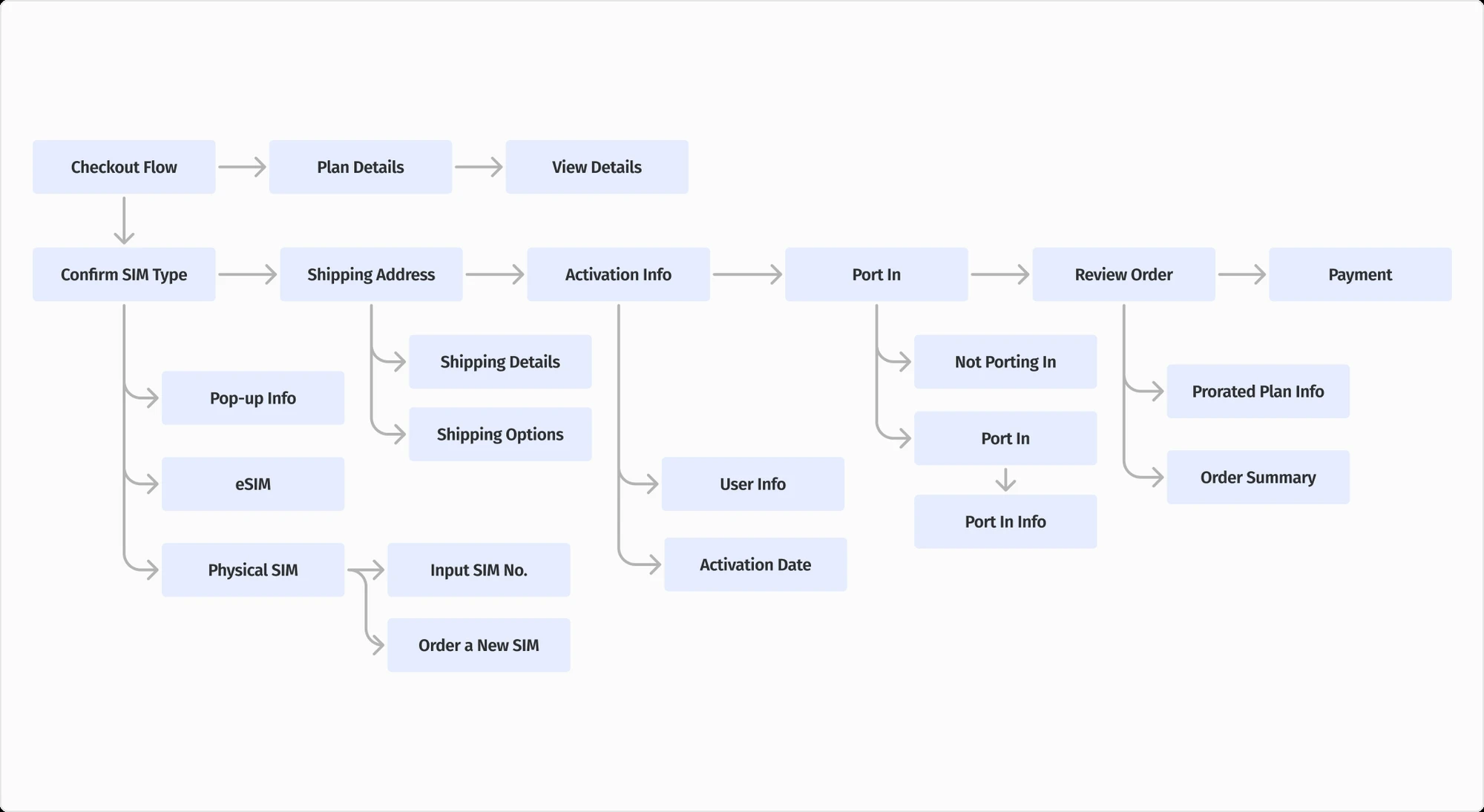
Turned the insights into a persona plus shopping and checkout flows.
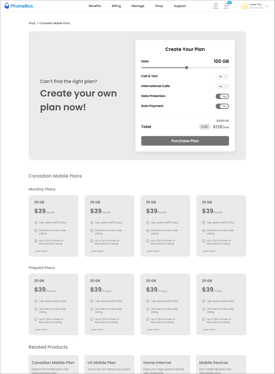
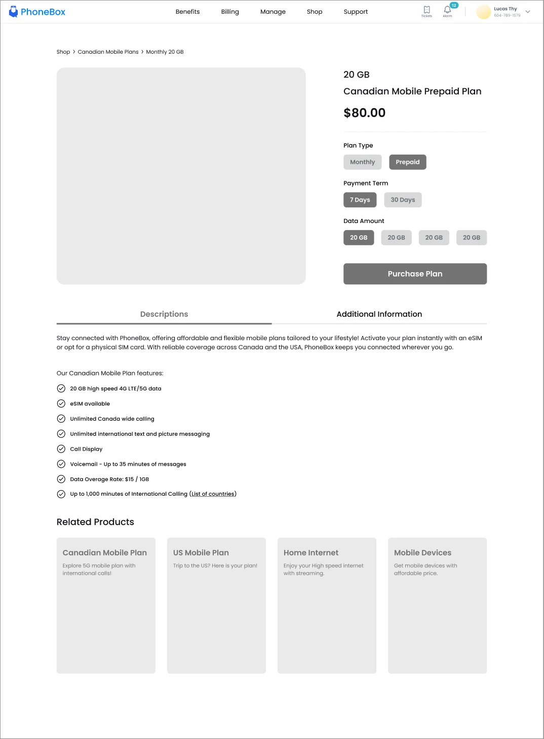
Sketched low fidelity layouts and refined them with cross functional teams.
Reused existing UI components so the new section felt native to the portal.
Ran internal usability testing and used the feedback to simplify the design.
Worked closely with developers on specs to avoid misalignment during build.
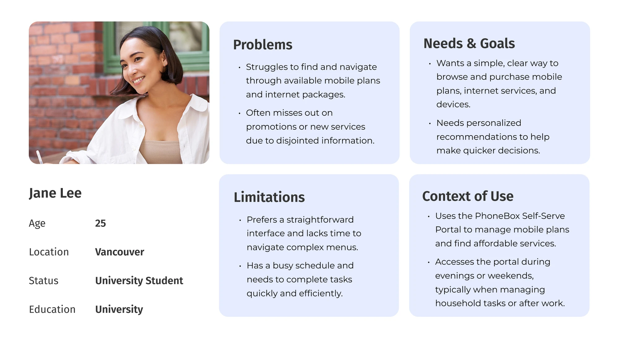
Designing around one clear customer.
Persona and user flows
Wireframes
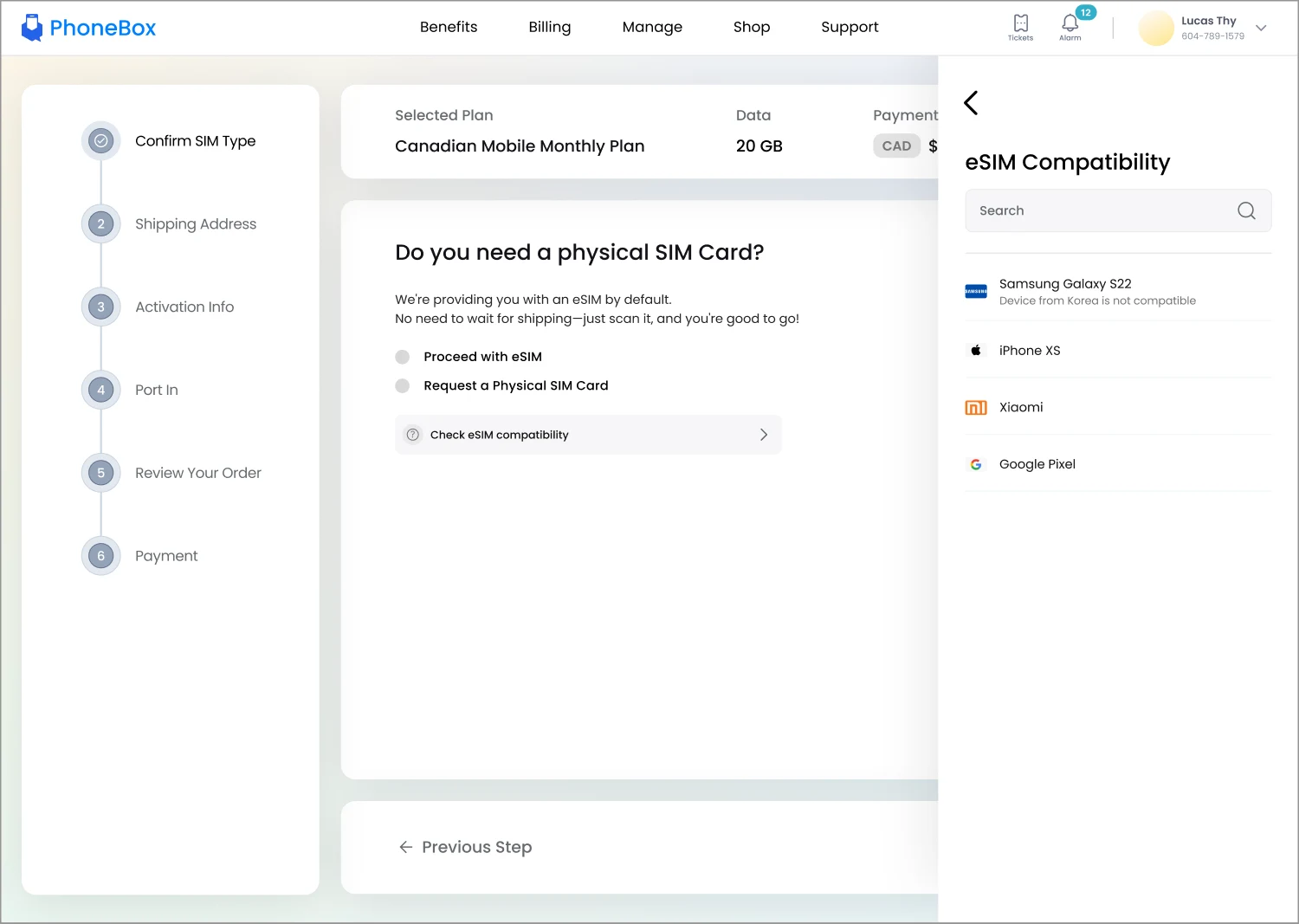
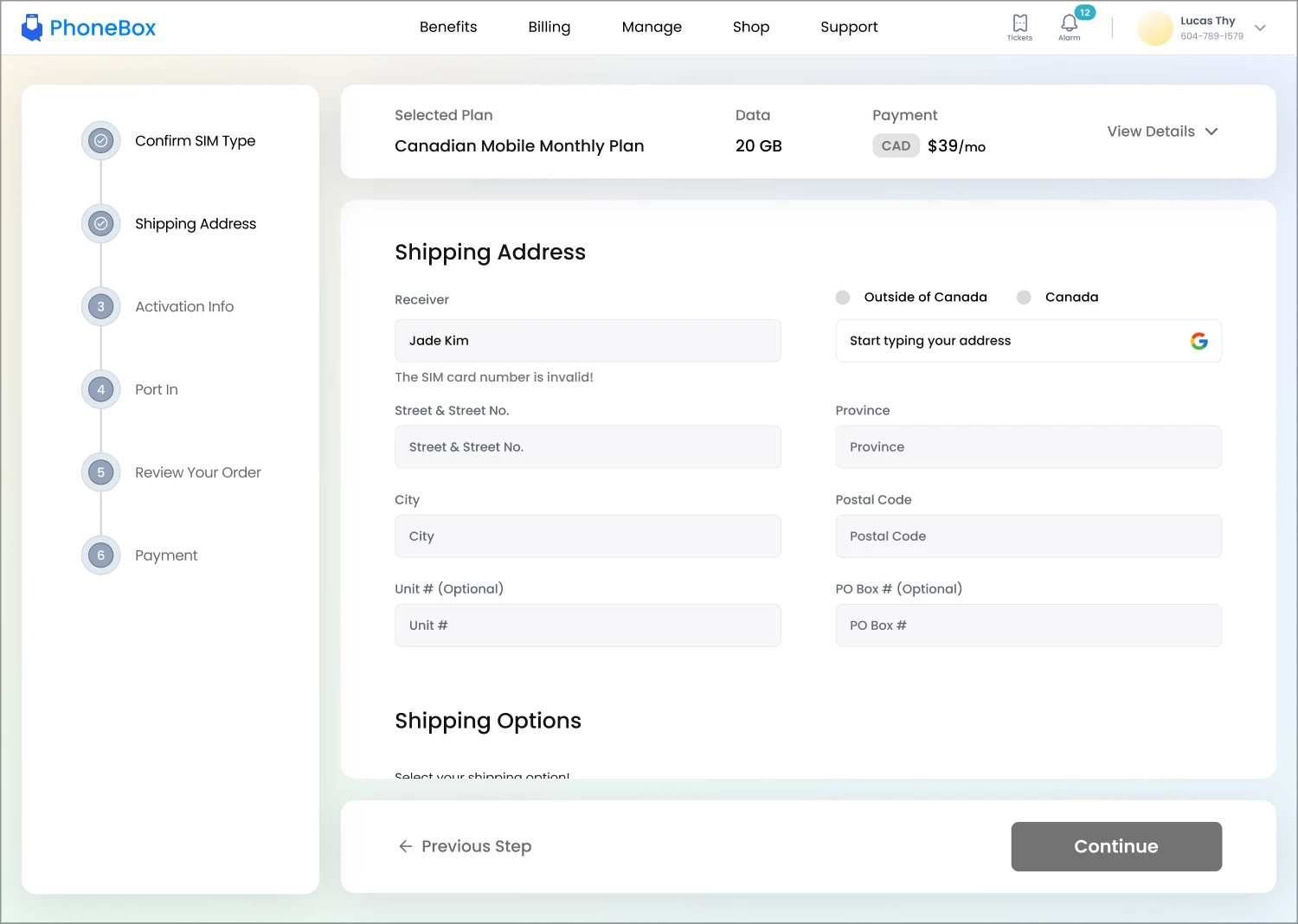
Shopping that feels part of the portal.
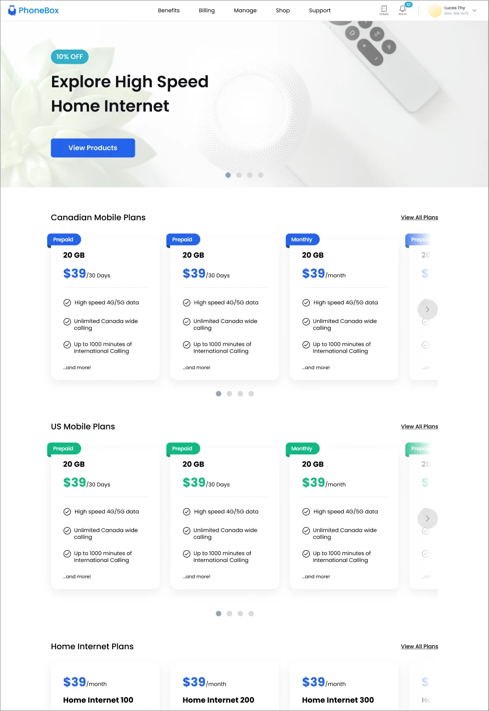
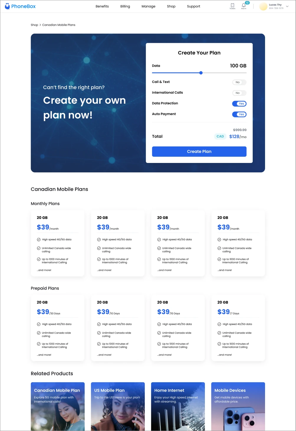
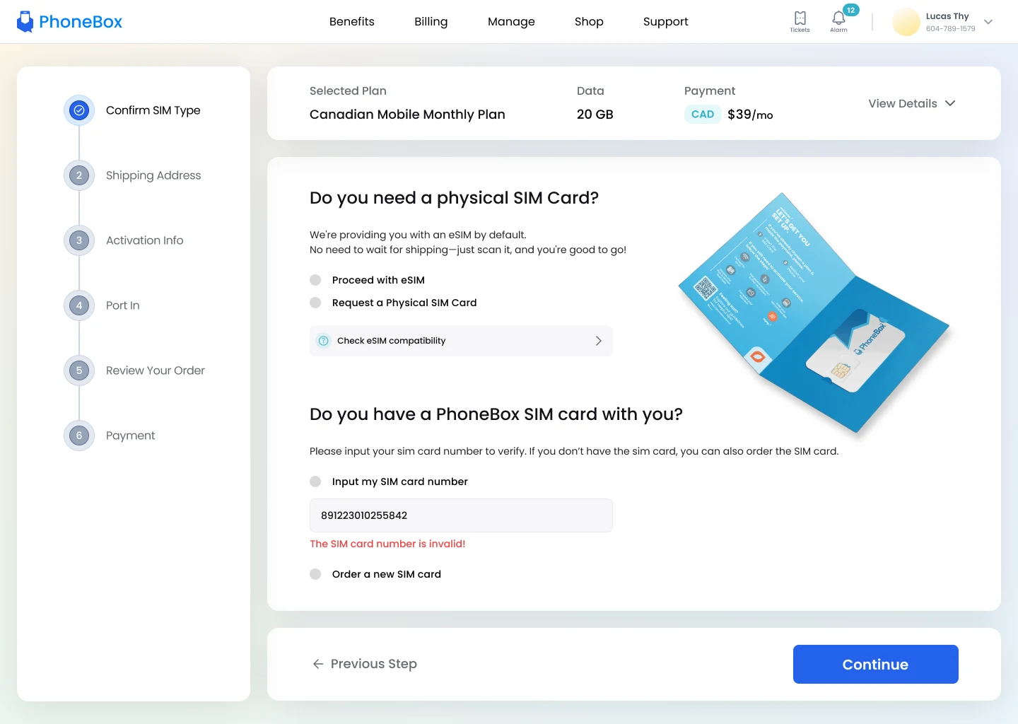
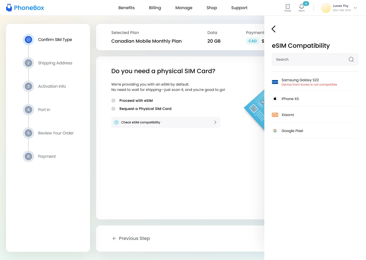
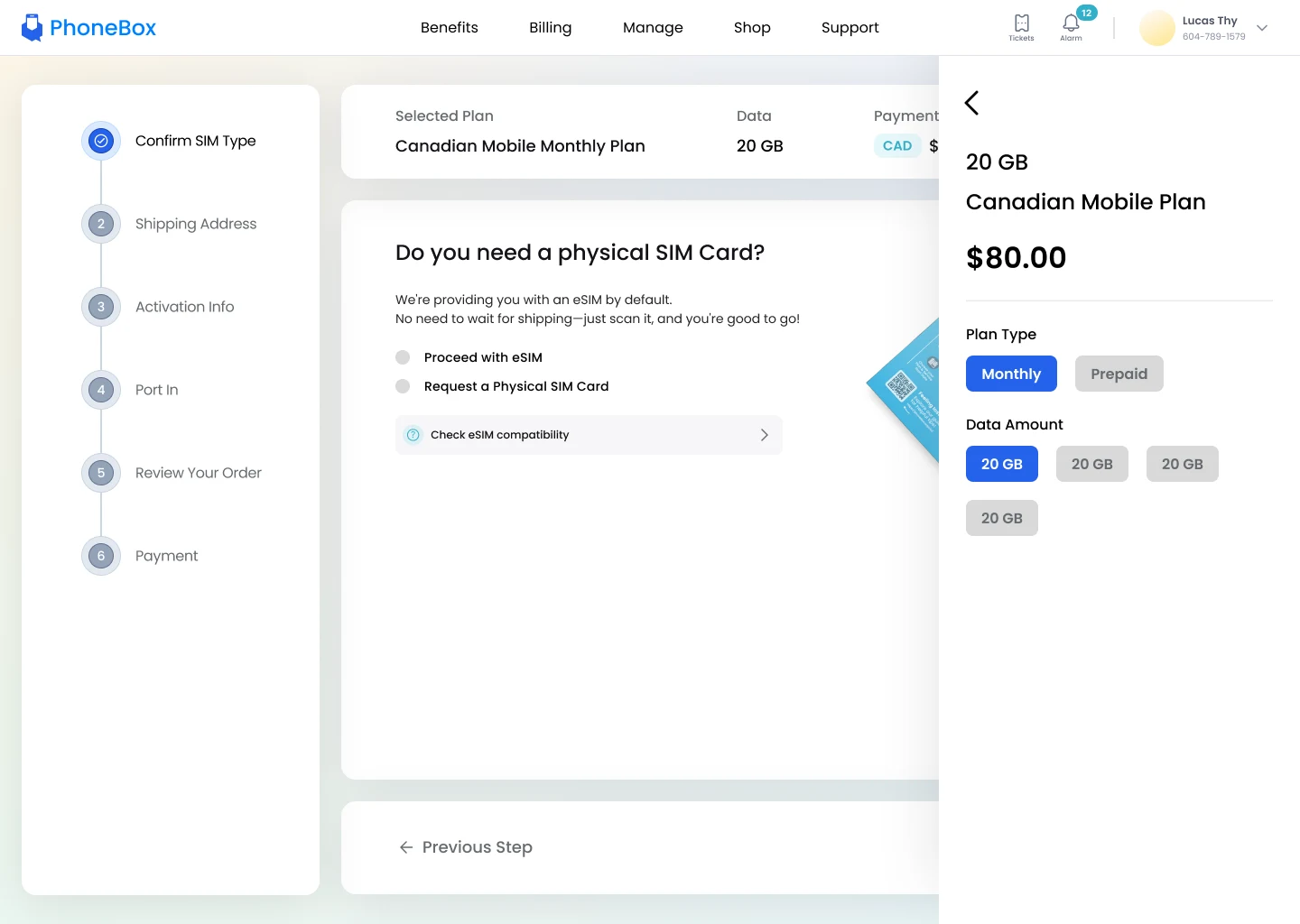
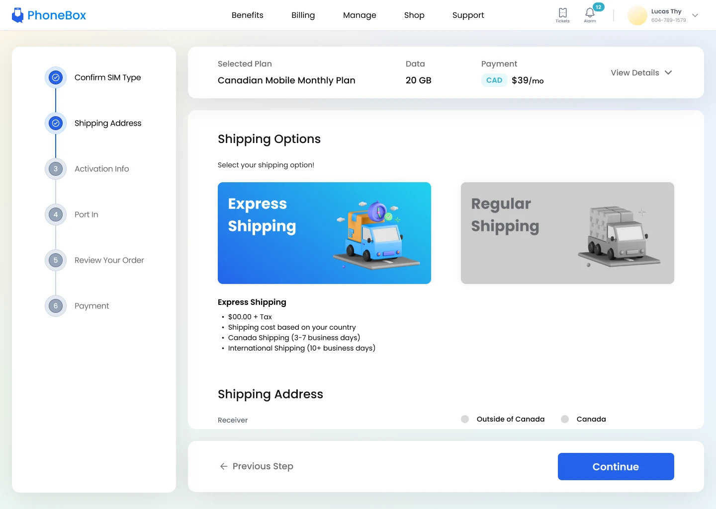
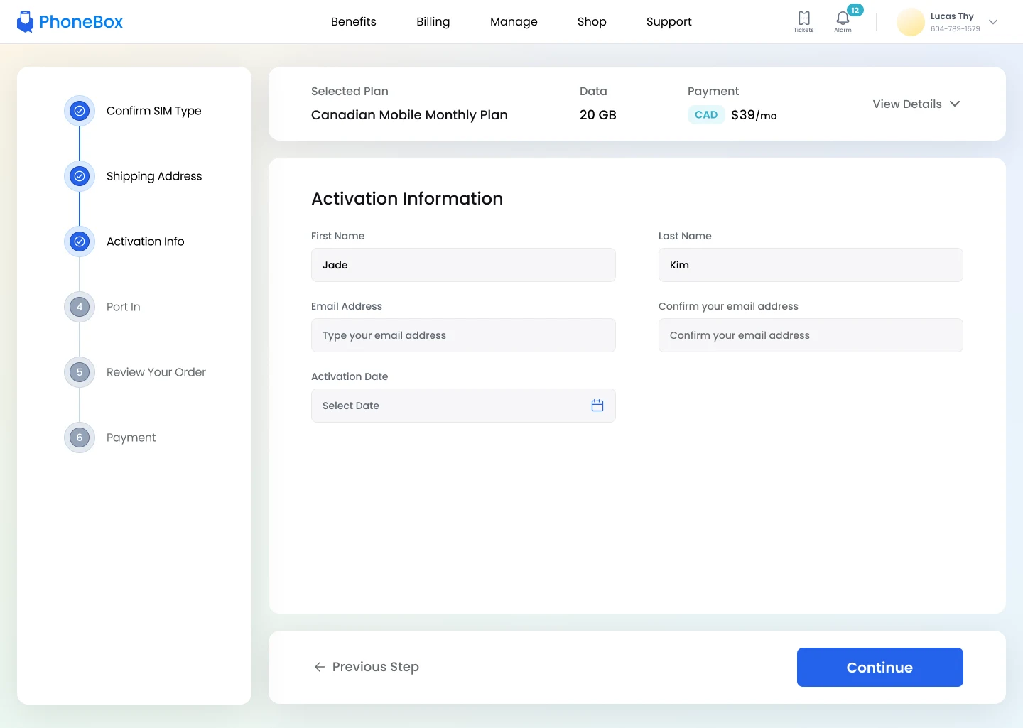
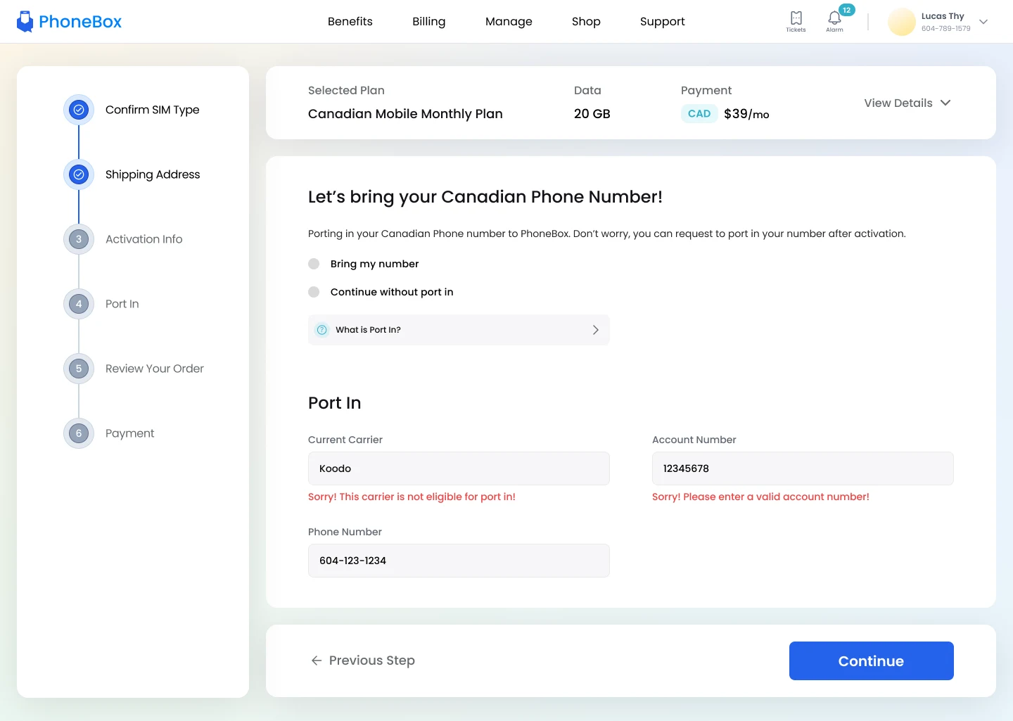
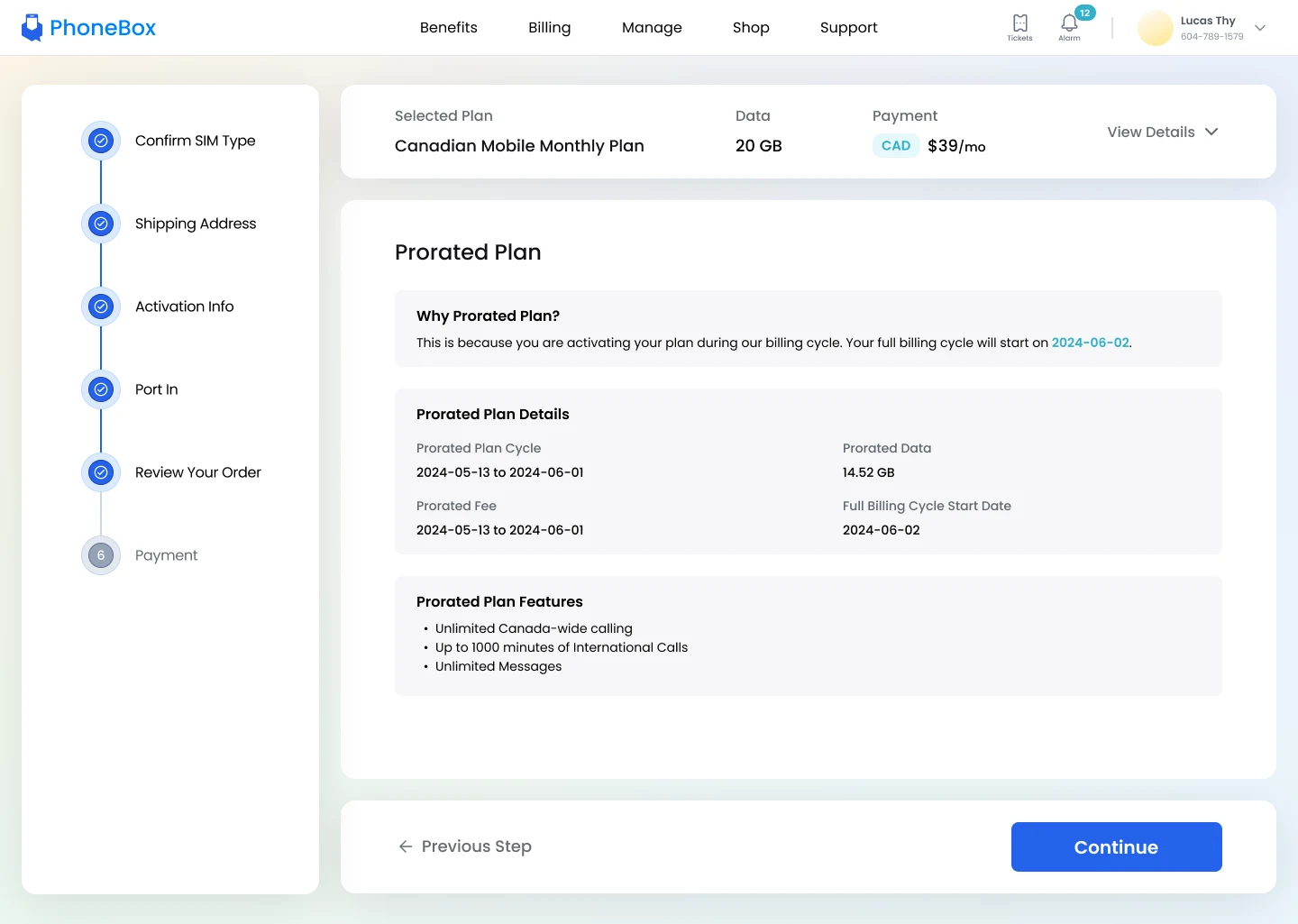
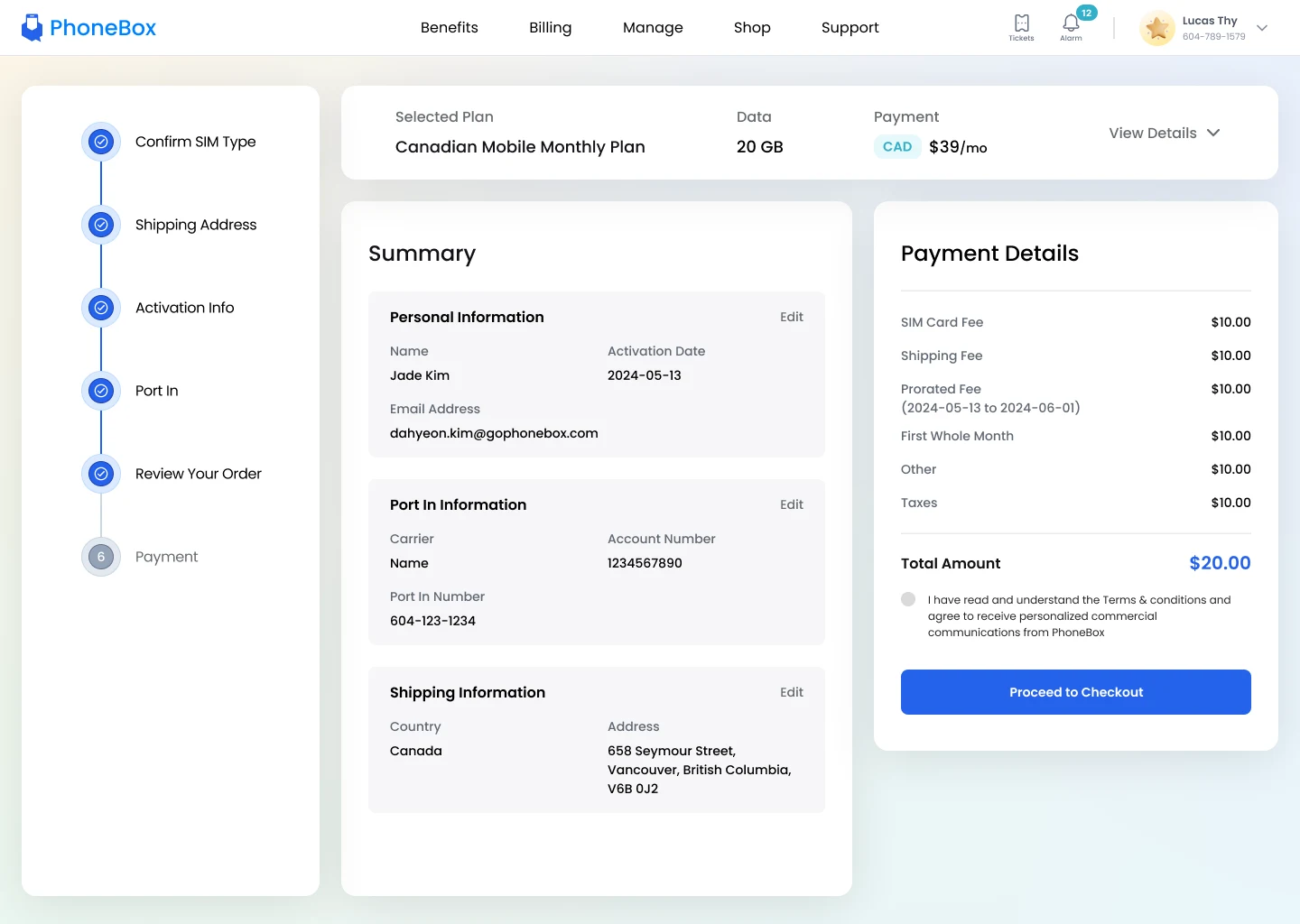
Plans, internet, devices and accessories are now one click from the account dashboard, with a checkout that keeps customers inside the same experience.
Shop

Checkout
What I learned and what is next.
Balancing aesthetics with function was key to fitting the new section into an existing portal. Detailed specs and close work with developers kept the build on track.
Refine the mobile experience for customers on the go.
Track how customers use the shopping section and prioritize improvements from the data.